vitruvi
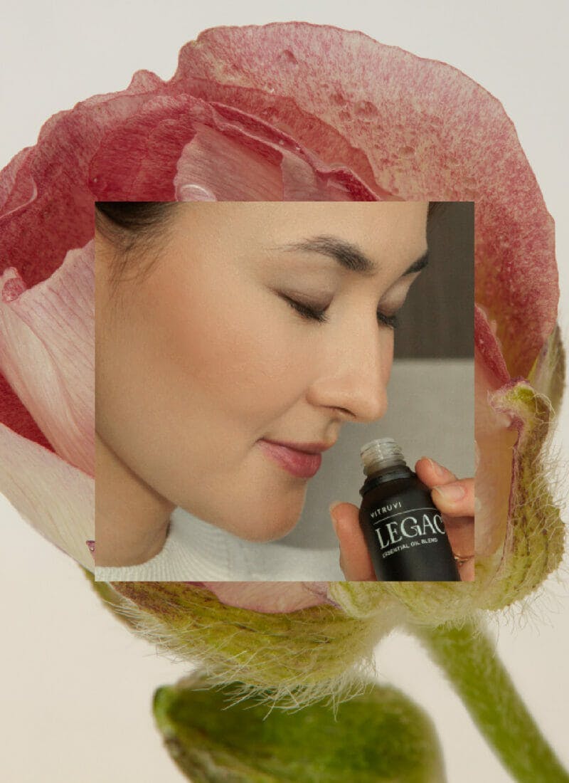
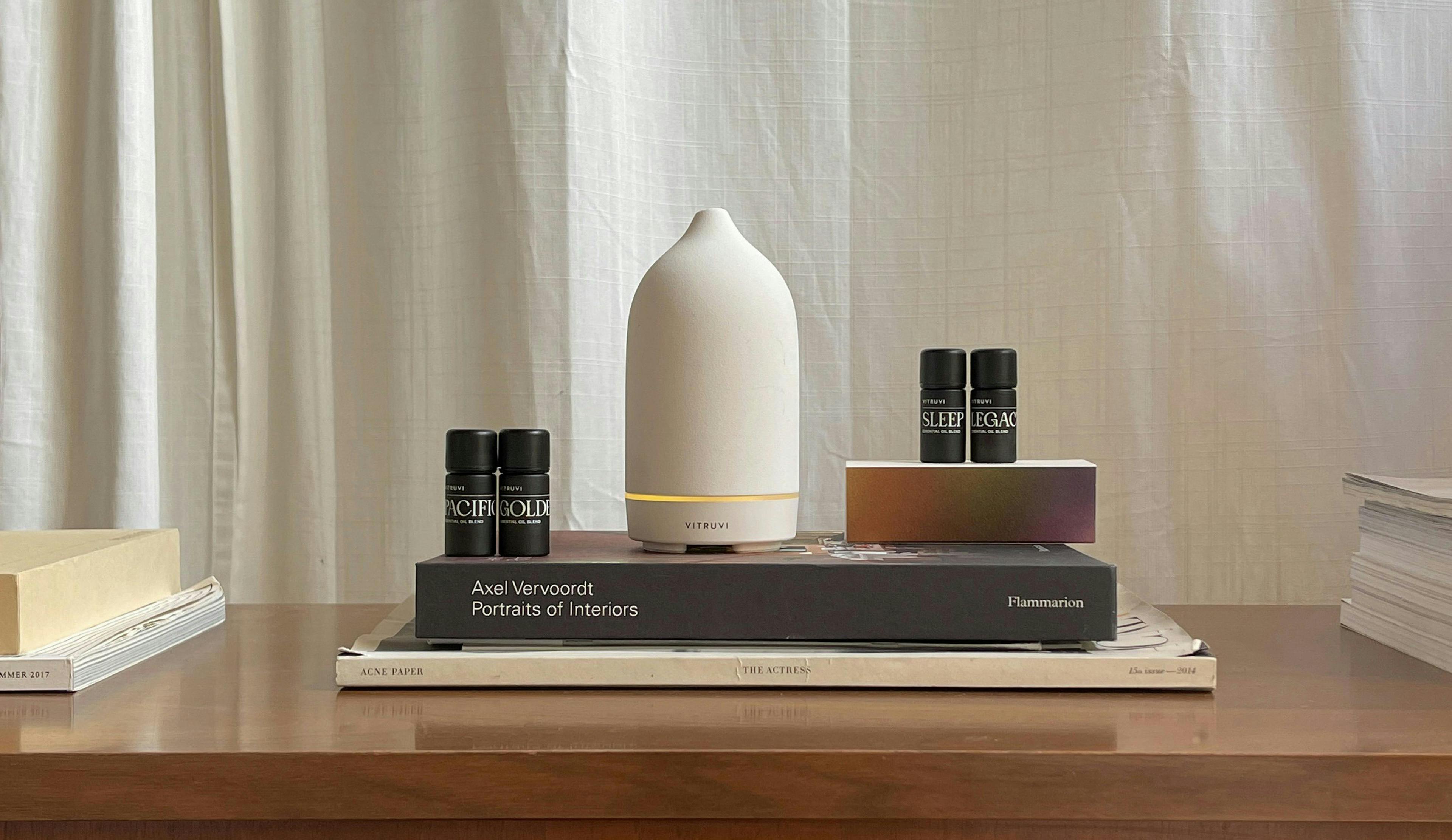
vitruvi is a leader in the home fragrance category with a unique positioning as a design-first brand. They came to Aruliden to elevate the brand expression as they expand into new verticals and move beyond essential oils. We worked closely with vitruvi to infuse sensorial elements to the entire offering and usher a new way of navigating scent – to take what we breathe and make it an air of change.
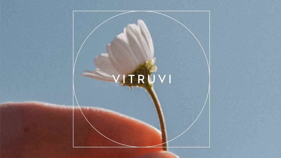
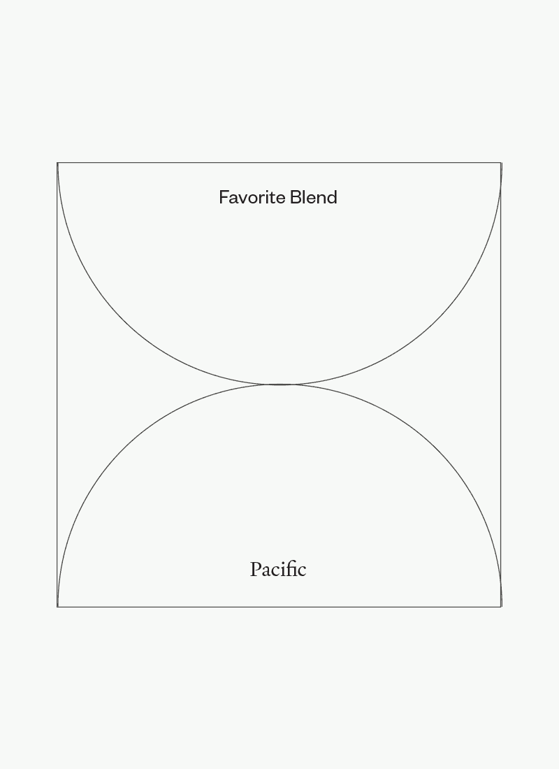
We were inspired by the vitruvian balance of science and nature, of the technical and the emotional.
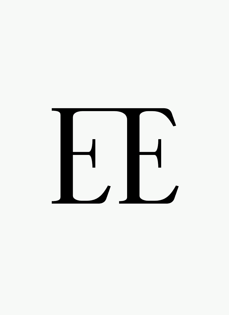
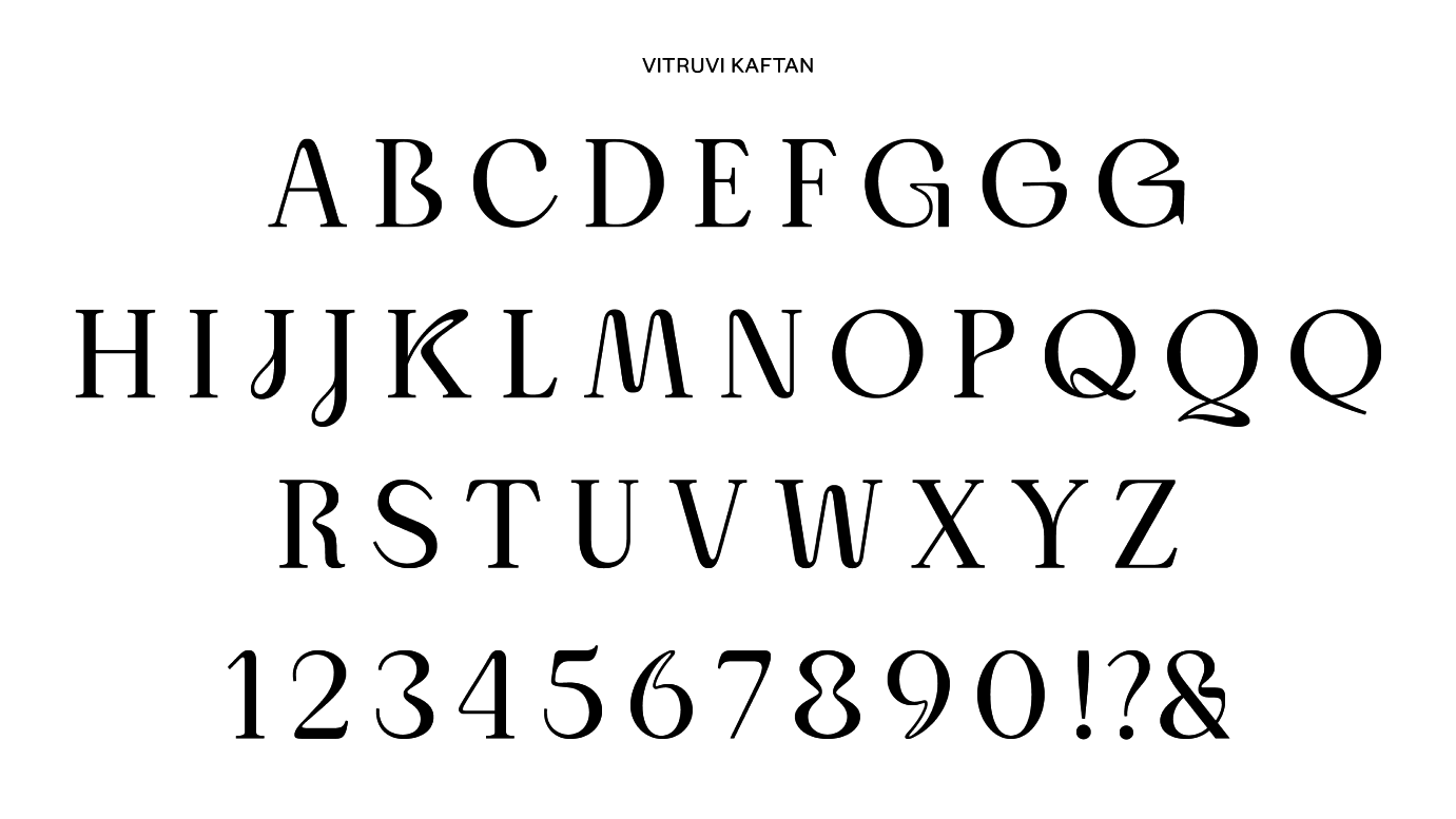
This comes to life in our customized hero typography and in our frameworks, literally using vitruvian lines, circles, and squares to highlight symmetry, harmony, and the connection between customers and their world.

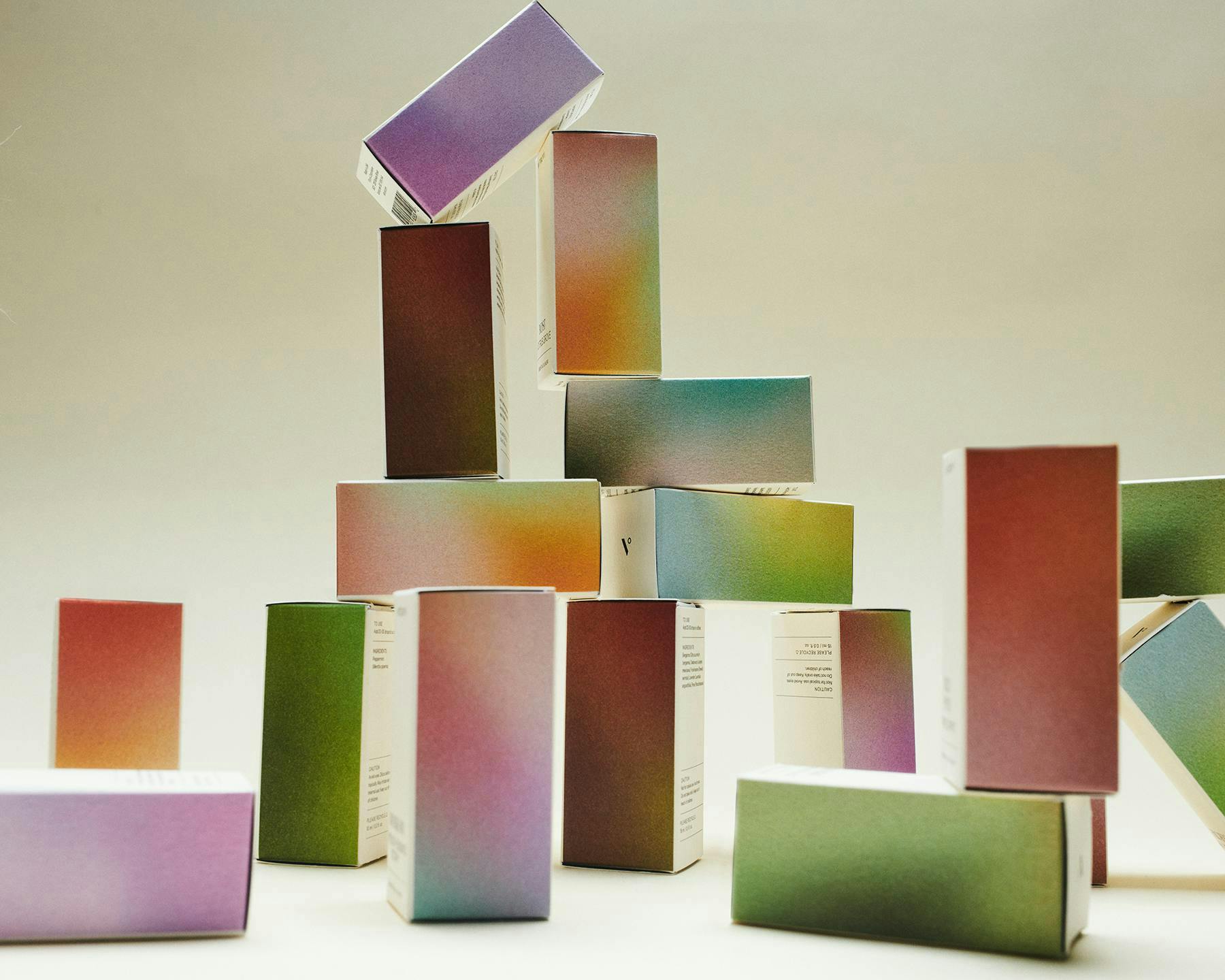
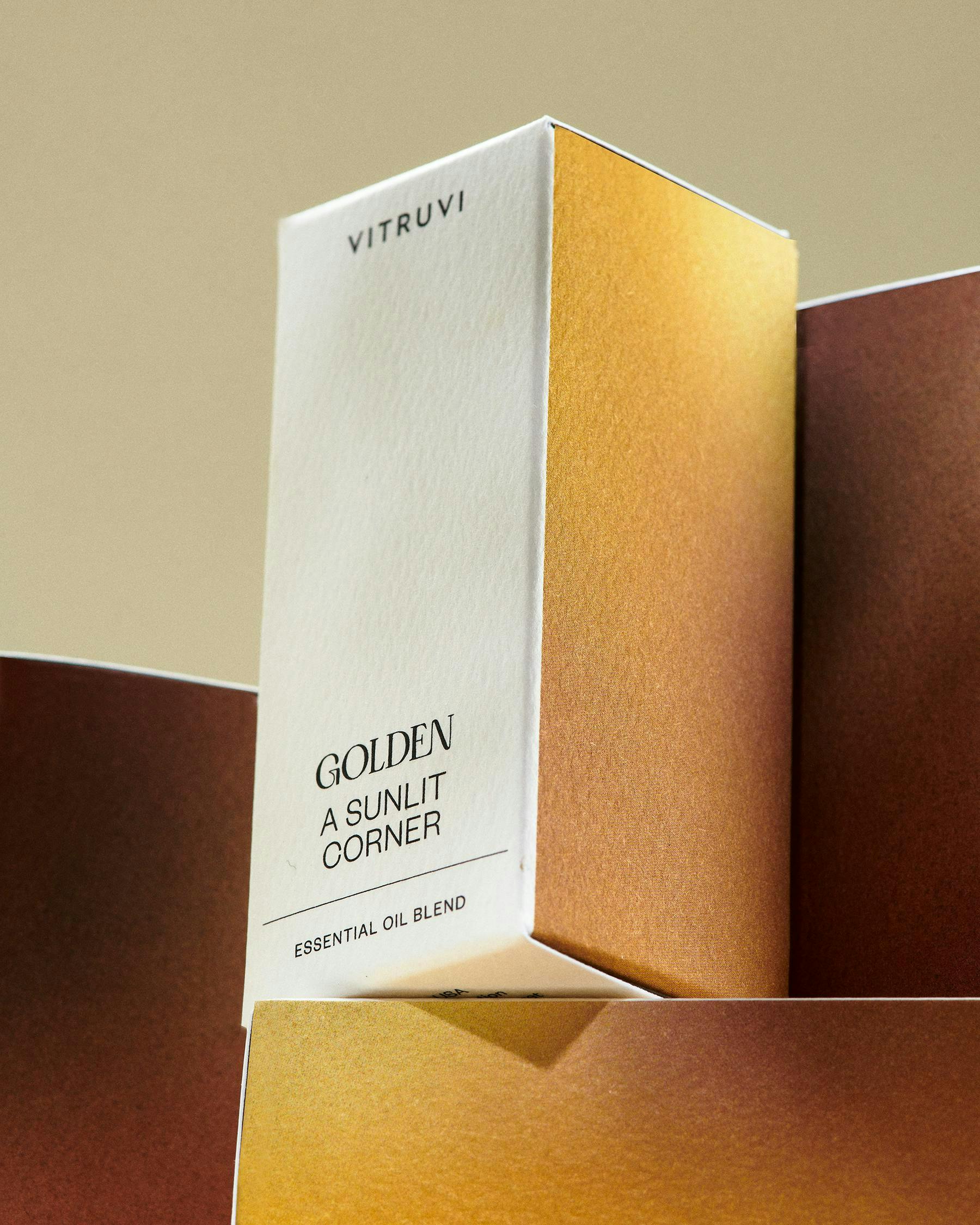
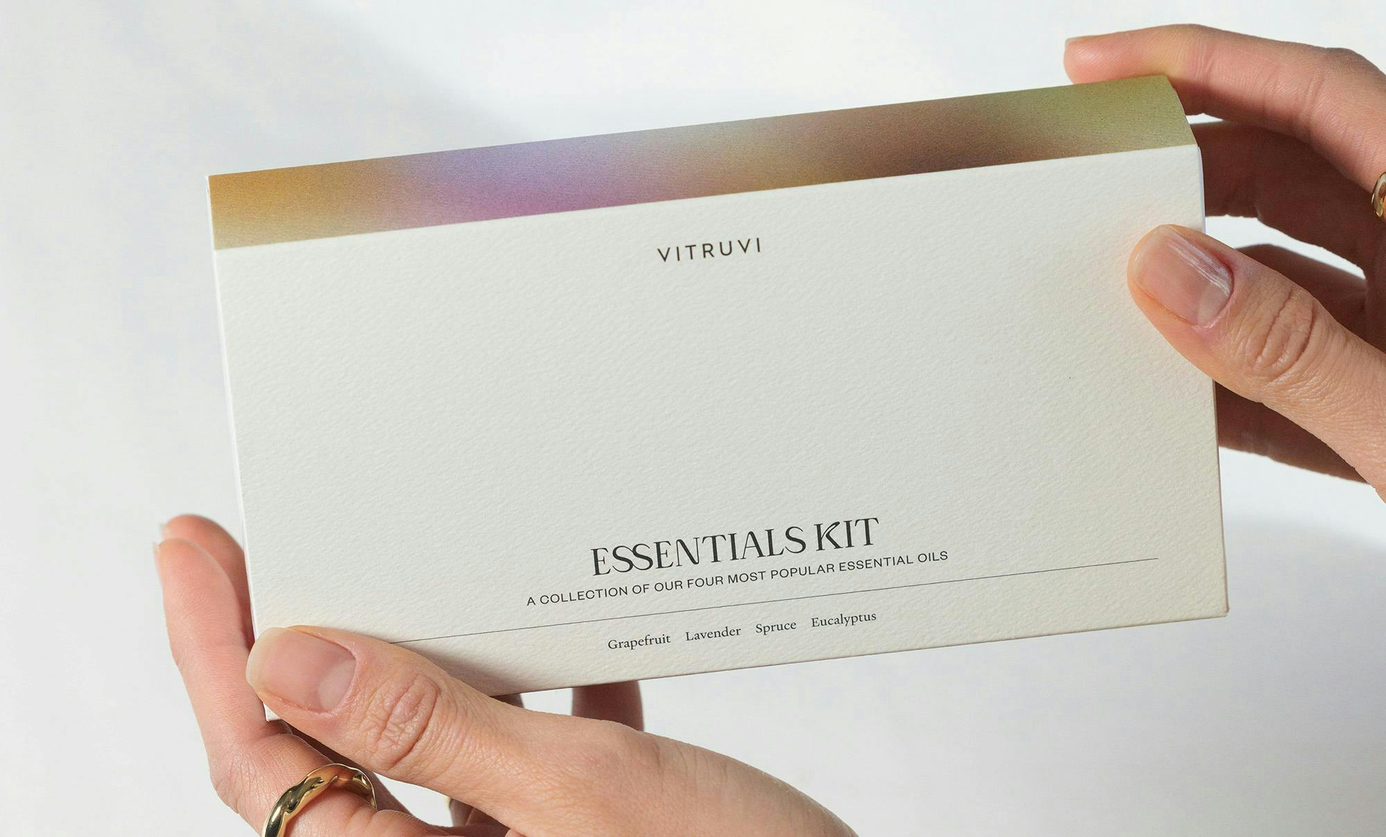
The new tagline, hero font, and packaging create a cohesive scent story that reflects the textures and colors of vitruvi aromas while transforming the invisible into everyday ritual.
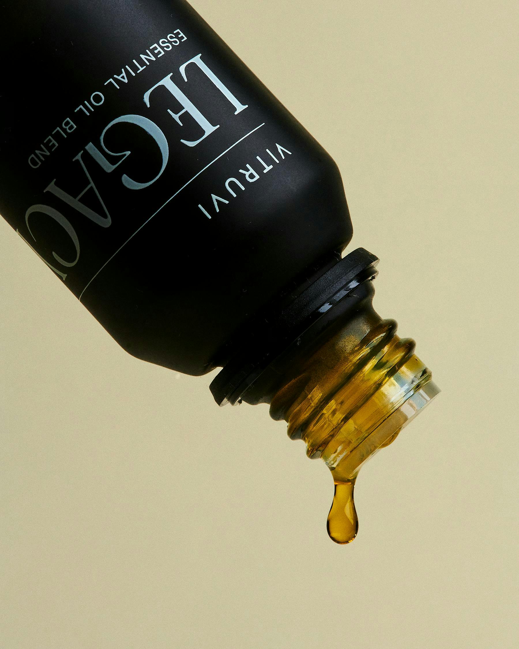
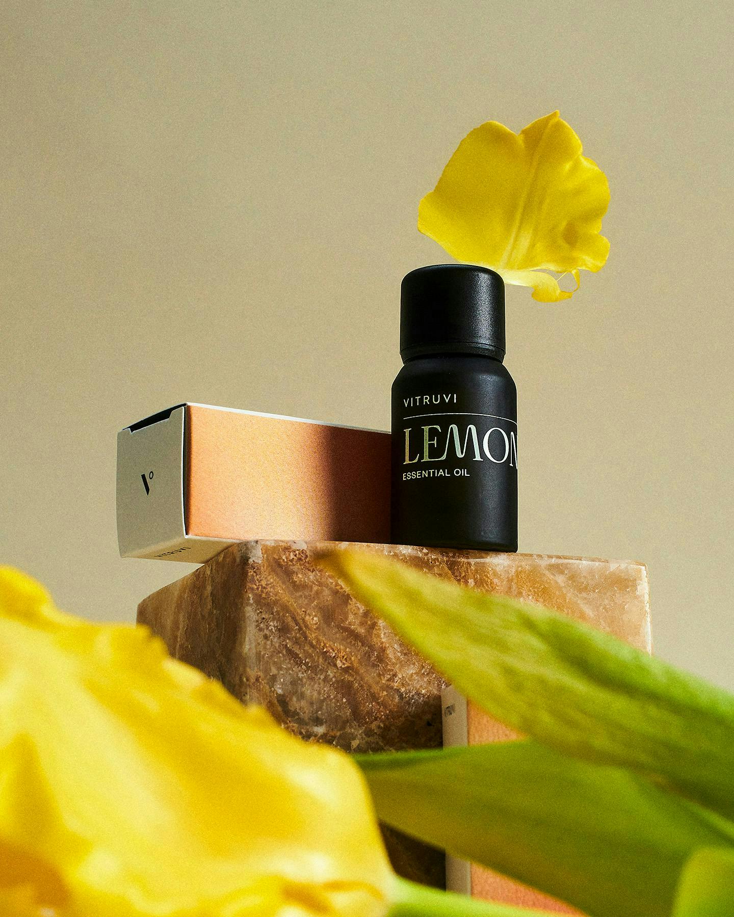
The new bottles and paper packaging are designed to strike a presence and sense of belonging in the home, balancing cleanliness with depth and permanence.
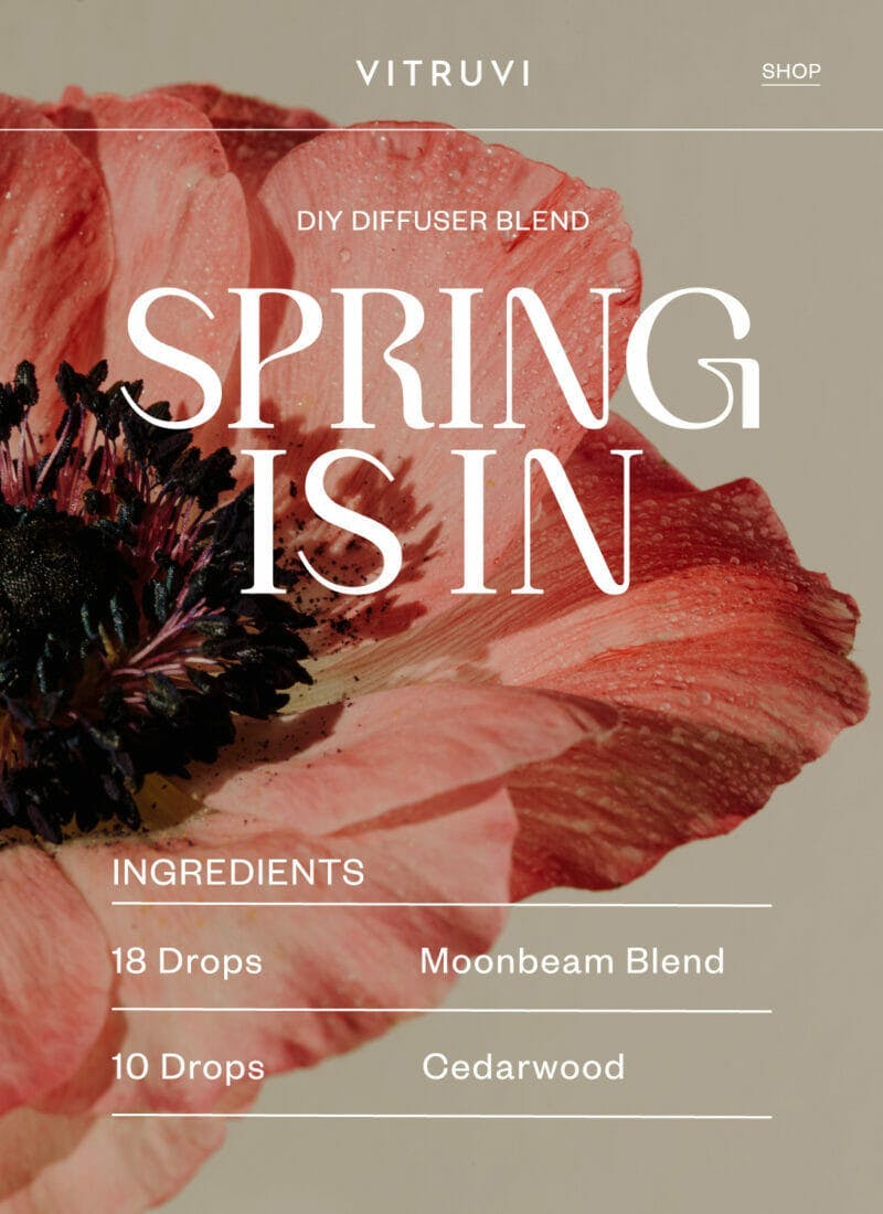
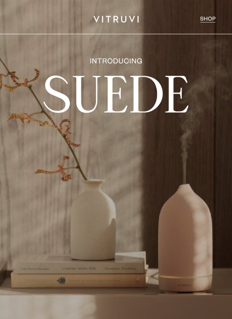
Our customized display face evokes the flow of air and contrasts with our modern clean sans serifs for bold design moments.